1. One of my two favorite works this year was the plaster sculpture. In that project we got to go outside the box and experiment with many different aspects of sculpture. There wasn't any ways we had to do it. The instructions were to carve a sculpture out of a pciture we drew of emotion. The process was very fun as I tried very hard to wrap my brain around the concept. It is also one of my favorite works because I think it is one of my best. I really was able to be creative and that is my favorite part of art. It is above. Project title: Sculpture
My other favorite most successfull piece was the 3D texture project. I really enjoyed the project because we got to do my favorite thing, BE CREATIVE. With that in mind I had a lot of fun with hte project producing one of my best works this year. The project directions were to display many different textures and designs on our thin block of wood. With those directions there were many ways to take and interpret it. Picture above.
2. These works stand out not only because there are my best but because it shows my carefull craft. Craft related to the project instructions. In the sculpture it was to show emotion which I kept in mind and thought I did a pretty good job of that through craft and TEXTURE. The second one shows yet again the vast spectrum of different textures which were the instructions. Also I kept it very simple and easy which makes the textures stand out. Here again patient craft and the concept of textures are shown very well. I could have easily gone off and just glued random cool stuff on but I thought that would be crazy and un-neat. So I laid back and was patient and made my simple yet complex work. I had to keep craft and patience in my mind in order to produce this.
3. My least successful work was one of our first projects. The one where we made a person doing parque out of wire. I did very bad on this because I never really understood how to go about making it. I was very confused and could never understand the craft that was needed to make a good wire person. I learned that before I dive into somethign I need to fully understand what I am doing. Keeping that in mind, I did that throughout the rest of the year. Now, I would have used a lot more wire so it is easier to see the shape. Also I would make a one wire thin base and just wrap wire around that.
4. My greatest strengths were defintely creativity and craft. When the two are put together I am pretty good at art. I don't like very specific instructions. I like a lot of room to use my creativity and usually it took me somwhere successfull. My craft was pretty good this year, it came a long a long way. I used to be terrible with craft but now I'm not bad. Just shows what practice and teachign does.
5. My overall effort in class was fairly good. At the begginign I was TERRIBLE at art and it was actaully pretty frustrating. To fix that I started really putting all my time and effort into everything so it wasn't that bad. I gave it my all in the actually craft part of each project. I put all my effort into the projects and tried to produce my best work. Also I really tried to open up in my blogs and say everything I had to say about the question or project. I could have improved by understnading more conecpets and vocabulary. I didn't get much of that for some reason.
6. I am very excited about drawing and painting next year. This year I wasn't too goood at drawing or painting and I hope to get a lot better because I think once good it can be very fun. However, I did come a logn way but I am still not good.
7. I really think my developed patience will go a long way. I have learned not to jump right in and kind of lay back and observe before working. This is most exemplified in my texture work where it was very simple and easy, not complecating and un-organized. Also the little photography we did this year I learned from. Not jsut takign the pictures but how to develop them on the computer and make changes to them.
Overall, I really enjoyed survey of visual arts because I got to do a little bit of everything discovering my likes and dislikes.
Monday, June 4, 2012
Friday, June 1, 2012
Landscape
Going into this project I was pretty excited to get back into the dark room and experiment with all the cool technology and different ways and settings to develop a photo. However, I started with the drawing part and wasn't to excited about that. After about the second day I really started to enjoy drawing with the ink. Soon enough the drawing was over and I had about 25 different ones. Only about 5 were good so that told me I should focus more on quality not quantity. I sometimes dont have the patience for drawing and I tink that is why I did a lot of drawings. Anyway, I am pumped for the dark room and after about a day found out how hard and frustrating it was. There were a lot of steps to make a good photo and it was very easy for things to go wrong in those steps. In the end, I ended up producing like 4-5 good ones that are depicted in my book.
Moving on to the book, I really wanted to show a clean, clear balance of different varieties of my work. Keeping that in mind I thought it would be cool to have a jacket which you can see in the picture above. I thought I did a decent job of that added different colors of ink and completely different nature photos. Some in the water, some of the trees. Overall, I really enjoyed this project as I saw my self grow and discover my liking for new things.
.
Monday, April 23, 2012
Changes to Sculpture
I painted the bottom half blue so at first sight it looks like water and then hopefully people see the legs coming out. I felt if I didn't do this, then it would be boring and the water would be harder to identify. I think my half blue sculpture will put it aside from all the other boring white sculptures. I really think I made the right decision to make mine unique.
Friday, April 20, 2012
Sculpture
This is my final version without color. I have made two legs coming out of water, to show the water I made ripples. My plan for the color is to make the water blue and the legs a skin colored color, like brown. I have finally put the finishing touches on, smoothing the surfaces and getting the right shape and form. Once i had somewhat the correct form i threw the chisel aside andf worked with smaller tools to avoid big mistakes. TO smooth the surface, i used rough surfaces like sand paper to make even surfaces.
My gesture is a very big person, that isnt to coordianted trying to do a hand stand in the pool. To show his clumsiness i made the legs not straight and somewhat on their way down. Henry Moore's work was inspirational to me because is art work is big people with figures that dont have realistic or normal form. In my sculpture I tried to keep that in mind. If I didn't see Henry Moore's amazing sculpture I wouldn't kjnow what would inspire me. looking forward I am going to put on my perfectly placed color and put my sculpture in the Branson hall of fame.
Tuesday, April 3, 2012
Interim Post
In my sculpture, the final product with look like the bottom half of a person is standing on their hips, throwing their legs in the air. One leg is going straight up in the air as the other is slanted ever so slightly away from the body. My intentions for the rest is the product is too mainly not brake a limp off because I have seen many people do it and it would be hard to recover for. Besides that, I also want to make Sure it is Easy to. Distinguish the two legs from each other which I am in the process of doing now. As you can see the legs aren't completely separated. I am focusing on texture and making sure everything is smooth and even. Once I accomplish my intentions I will touch it up by smoothing everything down.
Monday, March 5, 2012
Dark room and drawing room
In these pieces of work, I tried to take my time and put forward my best effort. Iv'e taken my habits in the dark room and mingled with all the resources to make a clear photo. However, the picture in the top right corner turned out well even though I actually messed it up. I think I had my appeture off and didn't leave it under the light long enough. FOrtunatly, for me it turned out cool in a different way. In the drawing room, I tried to be pacient and put all my effort into every mark. It was hard for me to do that while drawing the grass, but I tried to overcome my disability and come through in the clutch, which I thought I did a pretty good job of doing. Other than that, I found the rest of the drawing pretty easy.
In the drawing room I felt more comfortable because it was more natural, It wasn't like the darm room where I had to perfect and mingle with all these technological aspects. Also in the drawing room I was able to express myself mroe because I was in total charge of what was going on. I owned the pencil. However, I didn't own the dark room for most thigns confused me. In the future I hope to get more comfortable in the dark room and put forward clear, crisp photographs. In the drawing room I would like to be able to focus for a longer period of time and put all my effort into every scratch. After about 30 minutes it was hard for be to focus and provide my best work. Overall, I thought this was a very fun project, being able to compare and contrast art work from the dark room and the drawing room.
Wednesday, February 15, 2012
Darkroom Work
I developed craft by really listening to Ms. Seal's advice and applying to my work. She advised me to put in a 4 filter, use 13 seconds and have the aperture at 11. By using that advice I was able to make a nice clear print. I used all the materials in the darkroom and made sure to use all the methods to make my print as good as possible. Some problems I came upon included my picture being blurry and out of focus but after talking to Ms. Seal I was able to fix the problem by adding 2 seconds and putting in a filter. Ms. Seal really helped get my picture to be focused not blurry.
Drawing
I developed this by first making a sculpture of random objects then we made value by putting light on it. After that I went forward and did the drawing. Clearly, I used pencils, an eraser, paper, eraser stencil and my objects. I used the idea of value, which helped show the light and shade. It was very hard for me to show contrast and value for some reason. However, after some help I finally got it down and applied it to my artwork. By biggest problem was not being able to show 3D, which is most noticeable in the golf ball. I solved that problem by looking at the rotation of the ball and not use straight lines.
Wednesday, January 11, 2012
3D TEXTURE
My collection of textures are somewhat varied. I have a two more smooth ones. one rough one and one that is smooth on top and rough on the side. I organized my texture in four simple quadrants. I think with that method it would be easier to concentrate on texture.
I had to modify one of my quadrants when i painted it as the French flag. It wasn't what I had in mind but that is what it looked like. I had to change it and recode it black. I think I showed textures but in a simpler version. All textures were the same size. However, obviously there were different textures. SOme on the rougher side as some weren't.
I think I am pretty good with technology allowing me to experiment and make my final project better. In this particular project, much technology isn't needed. After doing all of these art projects, I have learned to be efficient. We are given a due date and if you haven't finished it, you will have to on your own time. At the beggining of the year, I did that quite often. However, after some experience; my techniques and habits have adjusted. I have learned to be more patient in drawing, meaning not to rush. I have leanred to take a good picture and edit it in Photoshop and I have gained creativity in the skill of sculpting. Like in this project, I went outside the crazy project idea like others and made mine simple.
I thought I was pretty involved, I gave my peers good advice and listened to what they said about my work. I has really bad at wraping my head around concepts thinking all of them were the same, but now I am better. I know that to do the project well I need to listen as the project and concept is being explained.
Overall, this was a project I enjoyed because it allowed us to be creative and different.
Monday, December 12, 2011
1. The most interesting part of this project was learning to do rubbings. The lady that came in two fridays ago that introduced rubbings to us was really cool and really inspired me to explore the world of texture. AT first my depiction of rubbing was more like rigid shapes which sometimes doesnt have any texture at all. Now, after doing rubbings, texture is objects that actually has texture, not just shapes. I better understand the concept now.
2. My best image was probably the one of the wood chips or rocks because there isnt a consistent pattern, it is completely random. Nothing is the same size or shape which makes the pictuer very intersting. They easily convey texture the best.
3. I think the most successful one was the one on the top right of this post. There are four different textures in different quaDRANTS on the paper and in the middle there are four circles. Each circle has the same texture of one of the quadrants. I think it is my best and is cool to observe.
4. My favorite collage is probably the one on the top left of this post. One, it is digital and has color which I think conveys texture easier. Two, there are many different picture which convey different textures. Lastly, in the rubbings there is only rough textures, in the digital pictures you can convey smooth textures as well.
5. I think I will definitely use plaster in my project. The technique Mr. O showed us using the rocks was very cool and I will use very similiar objects to convey a negative texture. I like the project we are about to encounter because it involves cutting wood and not very precise things.
2. My best image was probably the one of the wood chips or rocks because there isnt a consistent pattern, it is completely random. Nothing is the same size or shape which makes the pictuer very intersting. They easily convey texture the best.
3. I think the most successful one was the one on the top right of this post. There are four different textures in different quaDRANTS on the paper and in the middle there are four circles. Each circle has the same texture of one of the quadrants. I think it is my best and is cool to observe.
4. My favorite collage is probably the one on the top left of this post. One, it is digital and has color which I think conveys texture easier. Two, there are many different picture which convey different textures. Lastly, in the rubbings there is only rough textures, in the digital pictures you can convey smooth textures as well.
5. I think I will definitely use plaster in my project. The technique Mr. O showed us using the rocks was very cool and I will use very similiar objects to convey a negative texture. I like the project we are about to encounter because it involves cutting wood and not very precise things.
Tuesday, November 15, 2011
Pop Art
While making these paintings I used the basic painting utensils; brush. palette and paint. I followed the methods of compliment. triad, monochromatic, and analogous. WHile painting each painting I kept those painting methods in mind. I developed my craft by keeping long strokes in mind. It looked a lot better to have long strokes going the same way than short, stubby strokes going different ways. These painting have really helped me understand color and the different methods. At first, I didn't know what was the difference between anything (traid and complimentary) and now after actually painting each one, i understand it a lot better. Overall, I really enjoyed this project because it helped me understand and appreciate color.
Tuesday, October 25, 2011
Monday, October 24, 2011
Wednesday, October 5, 2011
Shapes: White on Black
Tuesday, October 4, 2011
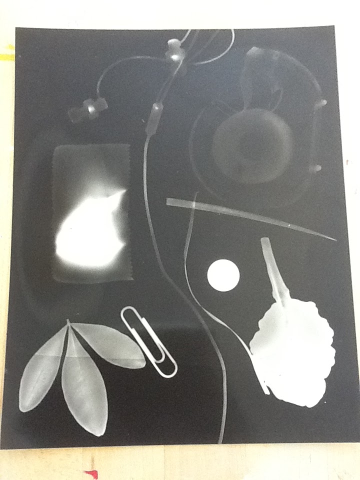
Rayograms
I made this amazing picture in the dark room.
Process
1. Place photo paper under light that isn't on yet
2. place objects on paper
3. hit button that turns on light and timer
4. after the picture process is done go through the whole developing process
In this project, my goal was to place objects on the paper in a somewhat intelligent way and still manage to have that random look. However, I had great trouble doing so, I just didn't quite know how to place my objects and convey one of the topics.
Wednesday, September 28, 2011
This is a black on white shapes image. I cut on shapes from black paper and simply pasted them on a white one. In this particular image my goal was to get the attention to the top of the paper where I cut out a trapezoid and then cut smaller ones out of the original big one. I did that because I think it is cool to have the same shape just smaller. Looks like a line, where the biggest are on the outsides and the smallest on the insides. I am very proud of this masterpiece.
Shapes
Justin Kaull and I were in the dark room on Tuesday, the 26. We used different items we brought in and arranged them in a random order to make this extrodinary rayogram. When the shot was taken we were in the mode, we were confident and had no thoughts of going back. After the picture process was done (7 seconds) we went through the process of actaully getting the picture to show up on the paper. Finally, we went in the light and saw the beautifull art work we had created.
Friday, September 16, 2011
Contour lines
1. 3 photos of line drawings
2. discussion of line drawings
3. photos of wire sculpture
4. discussion of wire sculpture
In art class we have been studying lines, part of doing so we have to draw objects. Here are a few of my perfectly executed pieces of art.
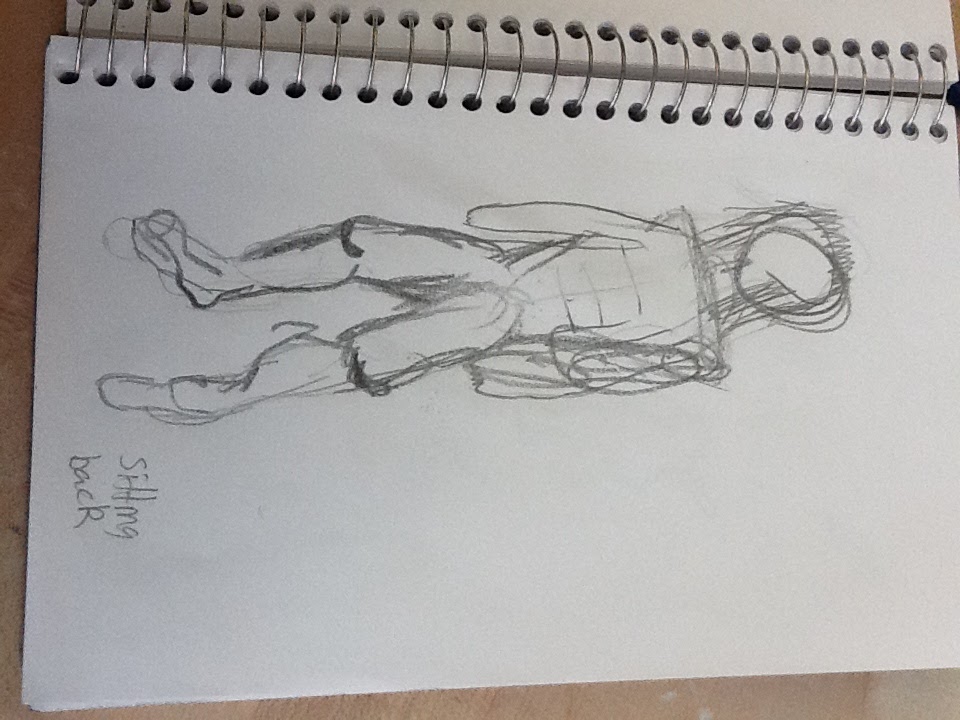
Our class subject was parkour, the image above is wire sculpture of a guy executing a back flip. While making this sculpture I thought i did two things exceptionally well. One of those is my skill of expressing my feelings and putting them forward into my art. My most enthusiastic one, is my ability to understand the art world. I have an imagination that I am Pablo Picasso. Being such a great artist I try to be the amazing artist he is. He is my inspiration and I always try to stay in character.
Subscribe to:
Posts (Atom)